
Lee Valley Aquatics
I bring visual identity, content and user experience together for an independent aquatics business.
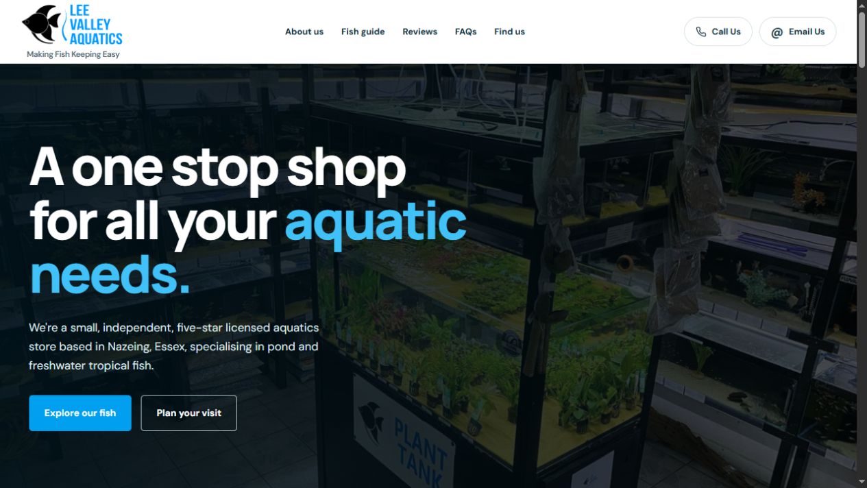
Real-world website, distinct from my application demos.
The problem or opportunity
A business website needs to explain what is on offer and help people decide what to do next. For Lee Valley Aquatics, my focus is a clear introduction to the shop, its identity and the information visitors need.
The concept & intended users
A real-world website for an independent aquatics business. I bring together website design, visual identity, content presentation and user experience. This is distinct from my self-directed application demonstrations.
Design & development
I approach the website as part of the wider brand experience: the language, visual hierarchy and imagery should feel connected. My background includes WordPress-based website development, alongside design and content work.
Key functionality
The homepage introduces the aquatics shop and provides routes to explore its fish and plan a visit. Contact details appear prominently above the main navigation, while the mobile presentation brings the headline and primary actions into a single column.
Design decisions
Shop photography gives the introduction a direct connection to the business. The hierarchy moves from a clear proposition to two practical next steps. On mobile, the navigation condenses into a menu and the calls to action stack, preserving their order without squeezing the desktop layout.
The result & next questions
The result is a live business website that brings identity, content and practical visitor information together. It demonstrates how my design experience carries through to a real public-facing site.
Questions to explore
- How quickly can a first-time visitor find the information they need?
- How clear are the contact and visit routes across different screen sizes?